
Research driven redesign of patient facing modules.
Making information gathering and memory assessments clearer, calmer, and more supportive for older adults.
Cogni.Dx: A digital diagnostic tool for early dementia detection, redesigned to reduce cognitive load and prioritise accessibility.
Client Testimonial
“Working with Amy on Cogni.Dx was a genuinely positive experience. She took the time to understand the clinical context and the sensitivities around cognitive assessment, and translated complex requirements into a calm, clear, and friendly user experience.
Her literature and user research produced designs that are thoughtful, accessible, and grounded in real user needs, and they have meaningfully improved how patients interact with the platform. I would highly recommend Amy for health and research-led digital products.”
- Dr Bushra Siddiqi - Founder & CEO, Cogni.Dx Ltd
Project Type
Redesign of patient facing modules within Cogni.Dx’s diagnostic tool, including history questions and cognitive assessment games. UX research & end-to-end product design.
Project Impact
Grounded in user research, the redesign prioritises accessibility and reduces cognitive load, transforming a complex and overwhelming assessment into a clear, supportive experience.
Role & Duration
Lead UX Designer & Researcher, collaborating with the Cogni.Dx stakeholders and development team.
July 2025 - Current (designs delivered, awaiting validation testing).
Tools
Figma
Canva
Miro
Google Drive
The Challenge
Cogni.Dx needed to redesign their patient facing diagnostic modules to be accessible, user friendly, and emotionally supportive for older adults with cognitive impairment, a user group facing significant usability barriers in the existing interface.
The users
Older adults and individuals with early onset dementia presenting with memory concerns. Many might have limited tech experience and are navigating a vulnerable, anxiety inducing moment in their healthcare journey.
The product
Cogni.Dx is a healthcare technology company developing a fast and accurate digital diagnostic tool for early dementia detection. The platform collects cognitive, behavioural, and medical history data through patient facing modules, delivering structured insights to clinicians.
Feedback from the previous study revealed significant usability barriers. I was brought in to redesign the history questions, cognitive assessment games, and dashboard to be more intuitive, accessible, and supportive for users with cognitive impairment.
The Discovery
The research combined user observations with 5 older adults (65+), a comprehensive literature review on dementia friendly design, and analysis of cognitive accessibility guidelines from the Alzheimer's Society, Nielsen Norman Group, and WCAG standards.
Ethical considerations
Due to ethical considerations around capacity, consent, and the emotional impact of early diagnosis, we focused on designing for older adults while applying evidence based guidelines for cognitive decline. Future iterations could involve Cogni.Dx's pool of diagnosed users for a more accurate representation.
Our goals were to understand where users struggled with the existing interface, what caused confusion or frustration, and what design patterns would best support users experiencing memory difficulties.
Key Findings
We uncovered critical usability barriers that directly impacted task completion and emotional wellbeing. Users consistently struggled with navigation, visual clarity, and understanding whether they'd completed tasks correctly, insights that fundamentally shaped every design decision.

100% of participants struggled with scrolling, especially horizontal scrolling on iPad. Several froze mid task, unsure how to proceed, and required assistance to continue.
100% of participants were confused by "Save & Return" vs "Next" navigation, users questioned "Return where?" and "Does it save if I don't press anything?"

80% of participants gave up on or skipped a game entirely after experiencing interaction issues, such as unresponsive touch targets or unclear game completion states.

60% of participants were unsure if the game had ended, asking "Have I finished?" and needing clearer completion indicators.
60% of participants noted poor contrast, which directly impacted their ability to see interactive zones and complete tasks.
60% of participants found button placement too low on the screen, hindering visibility and requiring them to search for next steps.
60% of participants tapped images repeatedly, uncertain if their interaction had registered, particularly when first encountering games.
60% of participants were surprised that Help launched audio only with no visible text or clickable FAQs, though they found the help button easy to locate.
40% of participants requested larger button sizes, noting difficulty accurately tapping target areas.
Define

Literature reviews revealed that older adults with cognitive impairment face many compounding challenges such as, reduced visual processing, difficulty with spatial navigation, and uncertainty about system feedback.
Our user observations with cognitively able older adults showed that even without cognitive decline, poor interface design caused frustration, confusion, and task abandonment, highlighting how critical accessibility is for this user group.
Key pain points
Navigation confusion:
Not knowing if they need to scroll, where buttons are located, or what happens when they press different options.

2. Visual accessibility barriers:
Poor contrast, small touch targets, and unclear interactive elements making tasks difficult or impossible to complete.
3. Lack of feedback and clarity:
Uncertainty about whether actions registered, games ended, or what comes next, leading to repeated tapping and hesitation.
4. Cognitive overload:
Overly formal language, unexpected audio, and unclear instructions increasing mental strain during an already stressful assessment.
From this, a critical user journey emerged:
Users want to complete their assessment confidently and independently, but the current interface creates barriers at nearly every interaction point, leading to users requiring assistance, feeling frustrated, task abandonment, and a loss of trust in the tool.
Ideate
I began by affinity mapping to synthesise observation data into six core themes:
Navigation Confusion
Cognitive Overload & Instruction Clarity
Interaction Challenges with Games
Help & Support Access
Visual Design & Accessibility Issues
Emotional & Physical Reactions
From these themes, I sketched a set of evidence based wireframes with design recommendations:
Improve navigation clarity
Simplify instructional content
Improve the help system for clarity and accessibility
Improve visual accessibility and layout
Build in system feedback and progress awareness
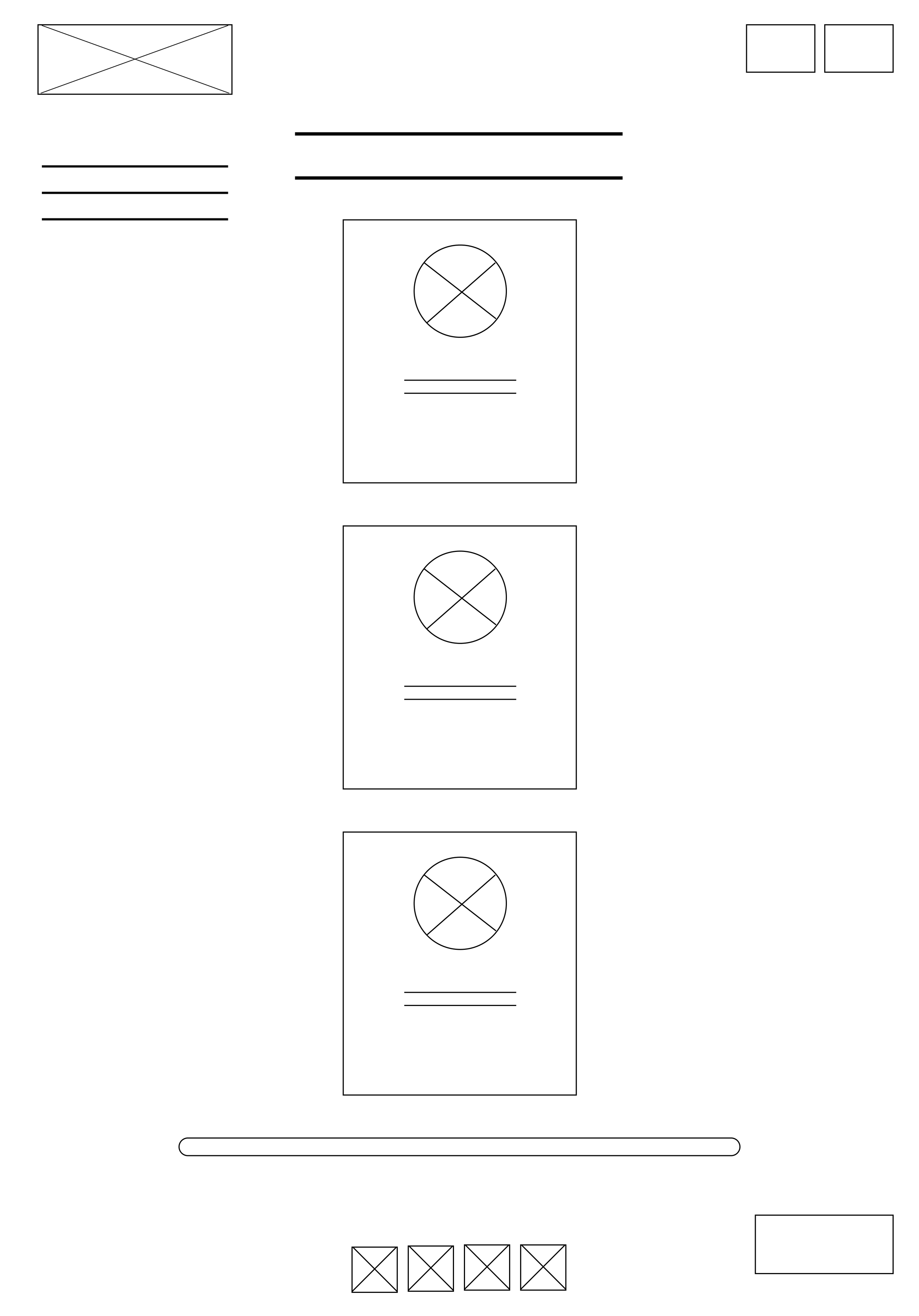
Lo-Fi Wireframes
The solution and final designs
I created high fidelity prototypes informed by dementia friendly design principles, WCAG accessibility standards, and direct user feedback.
Every design decision was grounded in evidence from user research and cognitive accessibility literature:
Use of Colour
All colours meet WCAG AA/ AAA compliance, addressing the 40% of participants who reported contrast struggles.
Purple reflects brand identity while conveying calmness, and blue supports healthcare trust.
High contrast schemes with plain backgrounds improve readability for users with reduced contrast sensitivity.
Accessibility Enhancements
Multimodal help system with both audio and text options
Larger touch targets and high-contrast interactive zones
Clear completion indicators and progress feedback
Typography and Readability
Heebo, a clean sans serif font recommended by the Alzheimer's Society, is selected for its readability and support for users with natural vision decline.
Large text improves legibility, and simple, familiar language replaces formal terminology, directly responding to the 40% of participants who found language "too professional."
Layout, Navigation, and Interface Design
Scrolling was removed entirely across the platform after 100% of participants struggled with it.
Navigation remains visible on every screen, with a clear home route and section breaks.
Button sizes meet Apple's 44x44pt minimum standard addressing the 40% who reported difficulty with button size.
All interactive elements are clearly labelled to prevent confusion, reducing cognitive load.
Language and Terminology
Simplified, jargon free, dementia positive language replaces complex medical terms.
Instructions are explicit and supportive, reducing cognitive burden during the assessment.
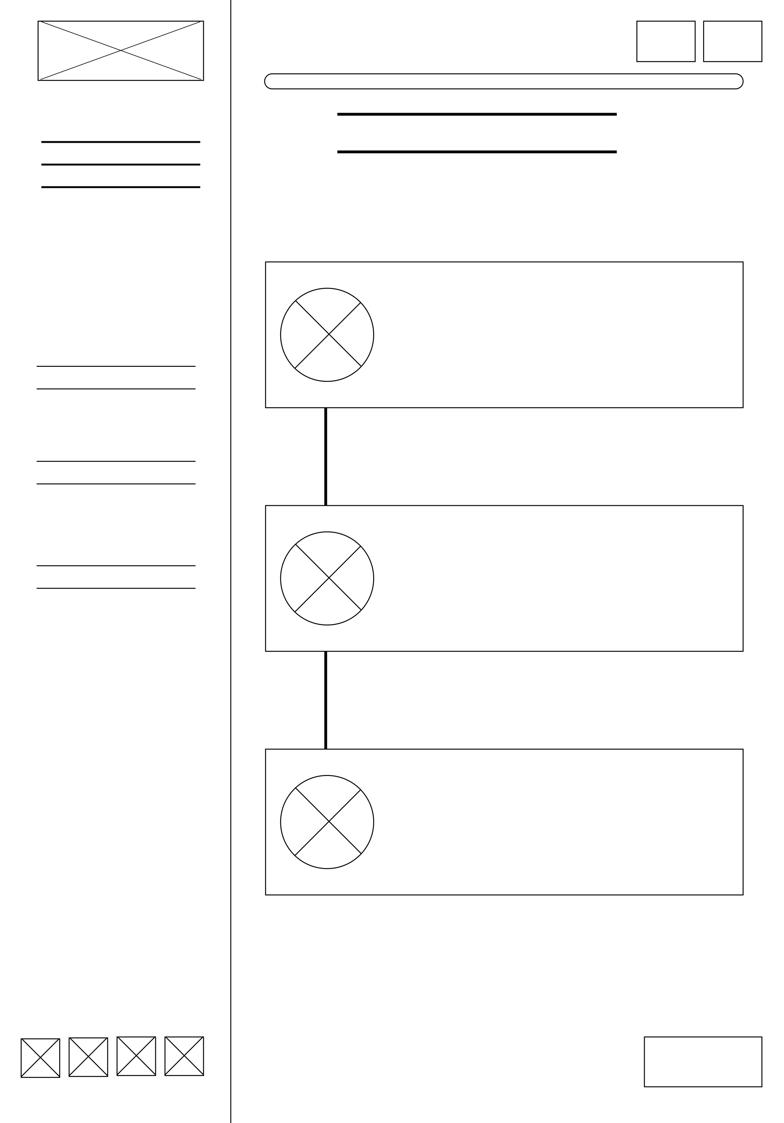
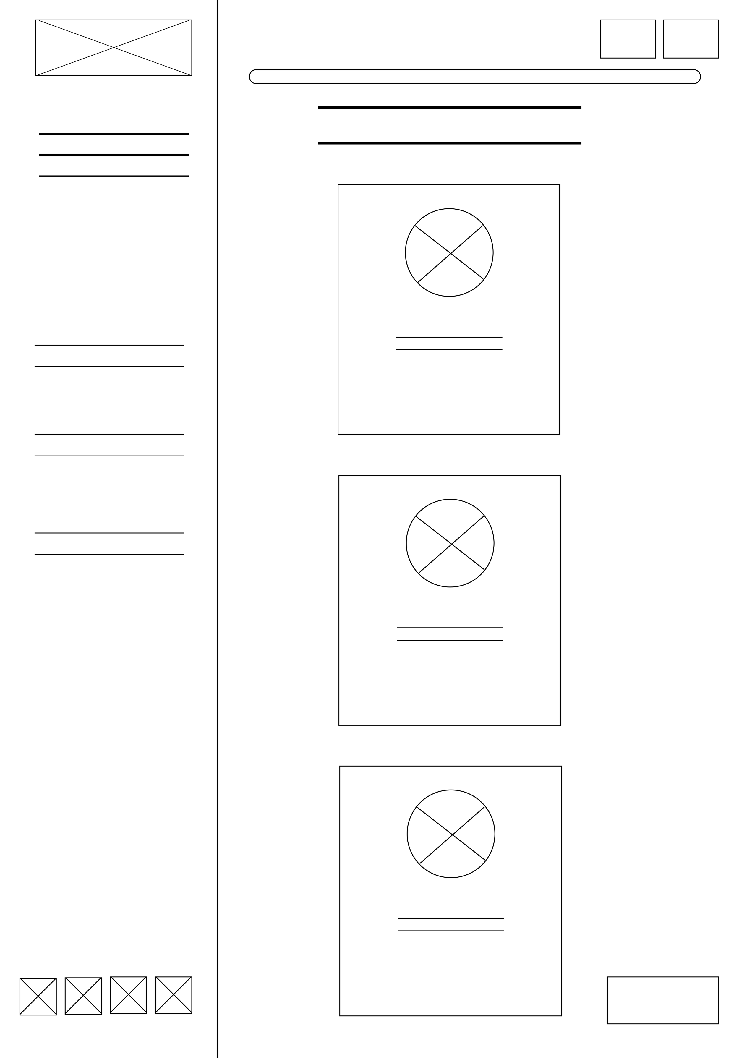
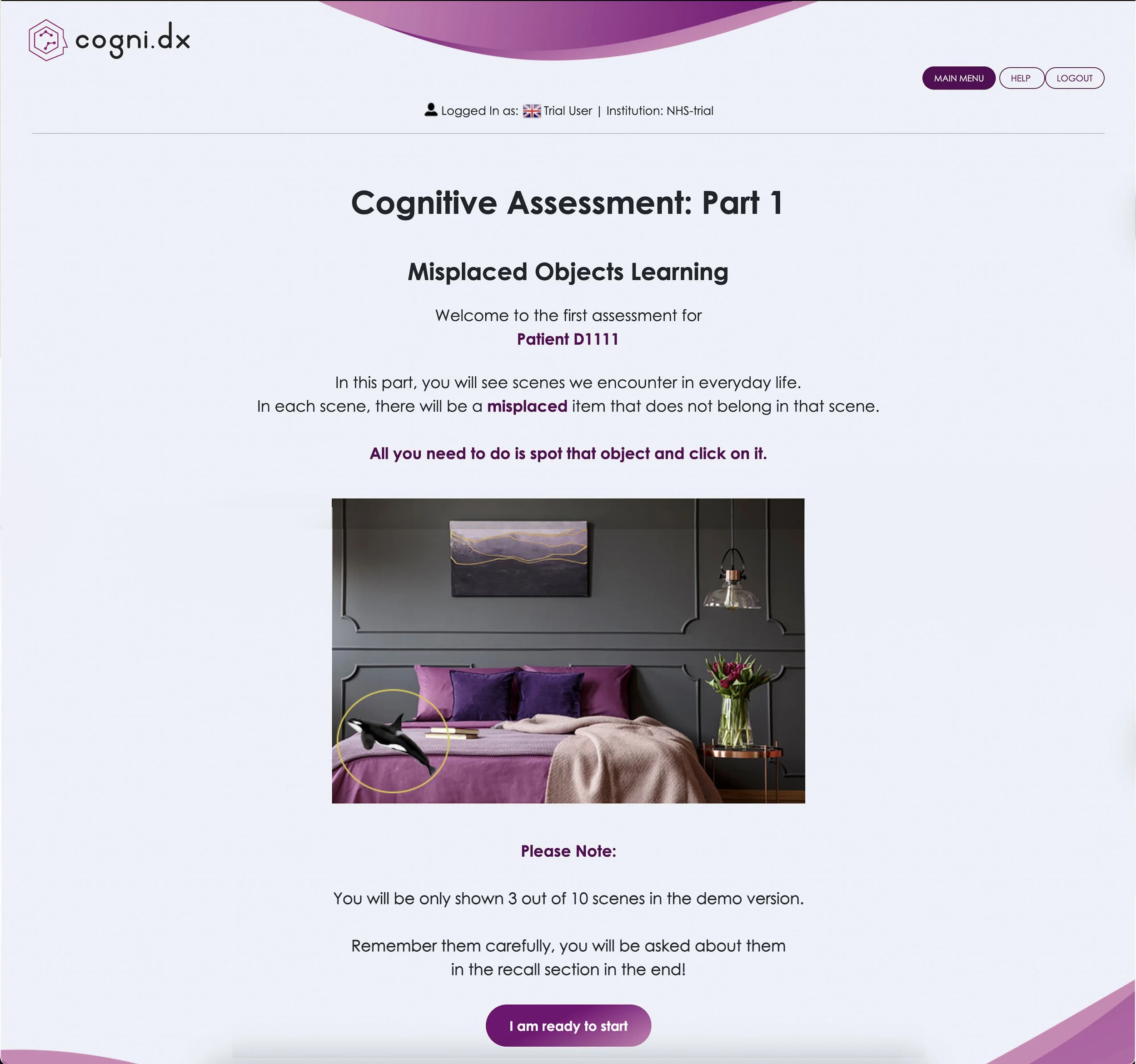
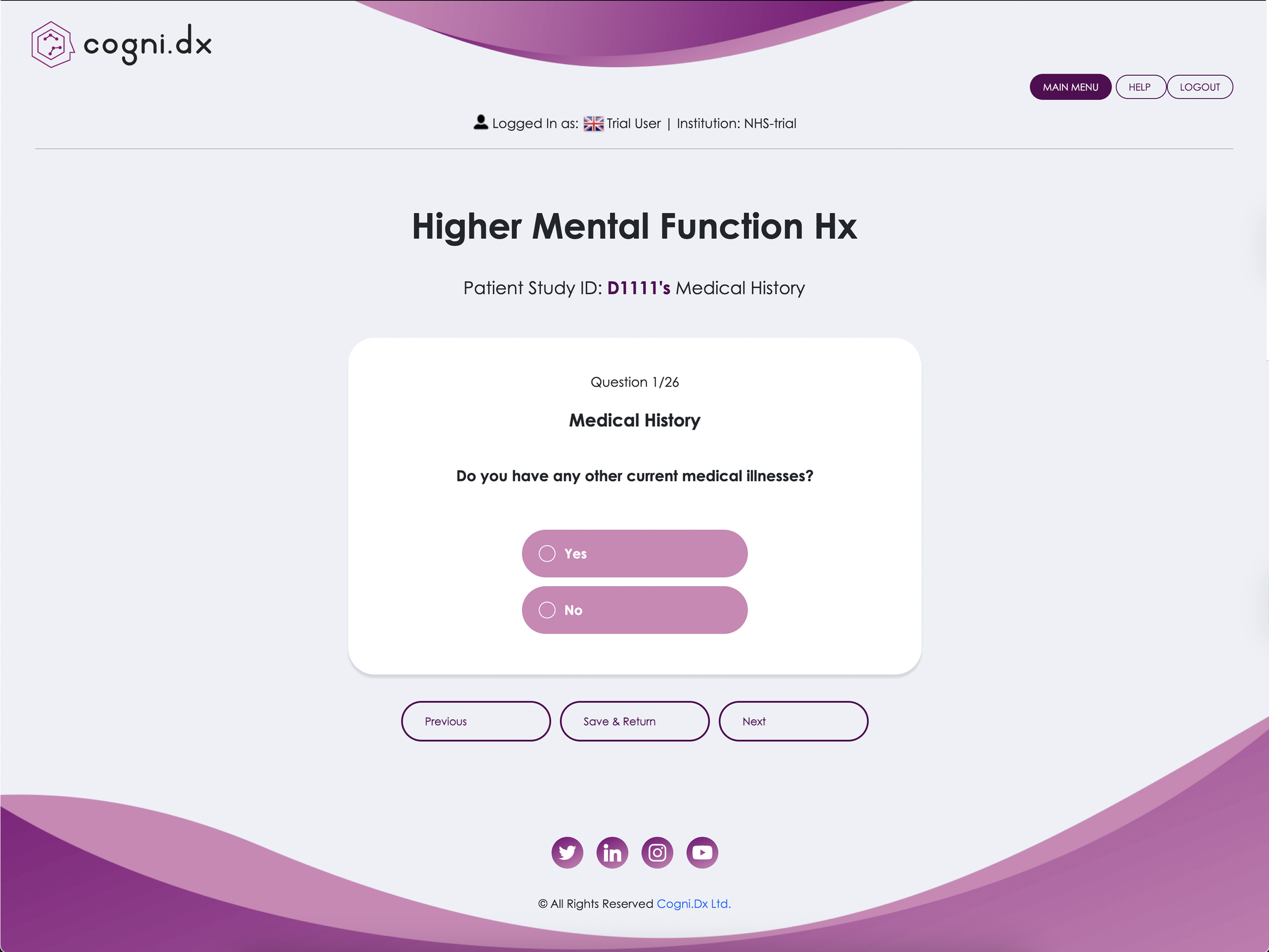
Below are three laptop screenshots of the old design.
These screenshots are different sizes due to some pages having a scrollable function.
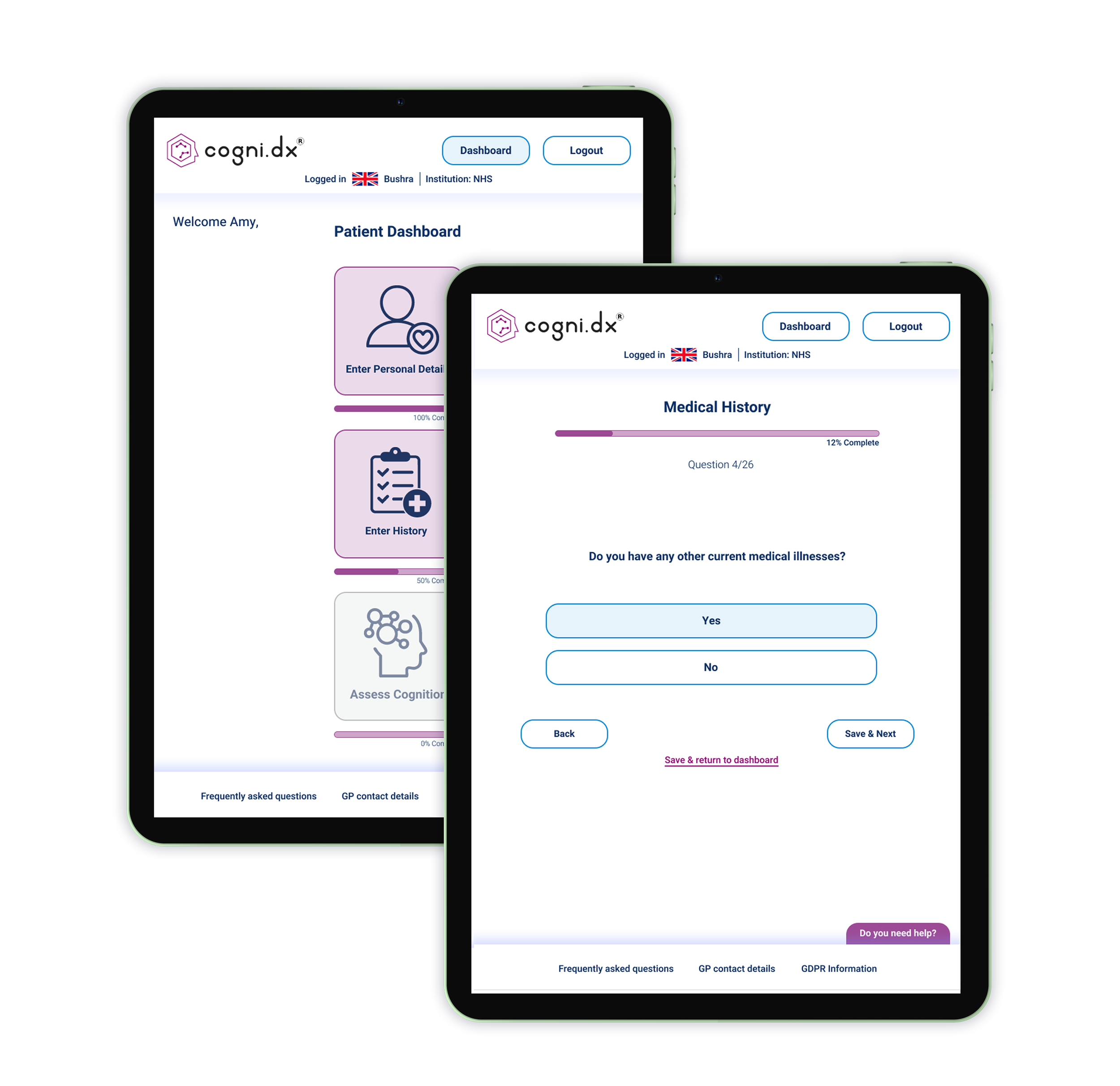
Old design
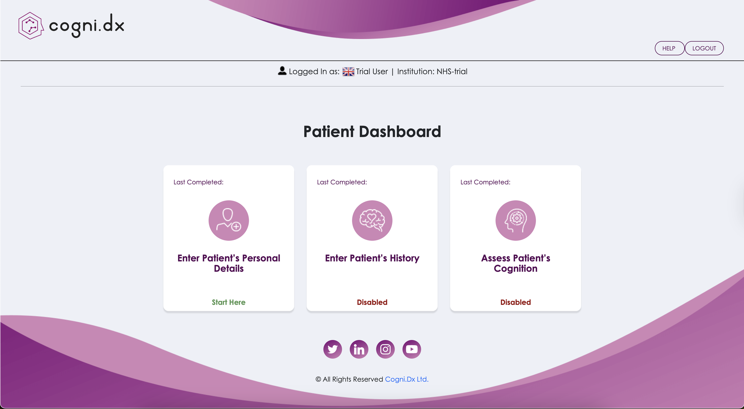
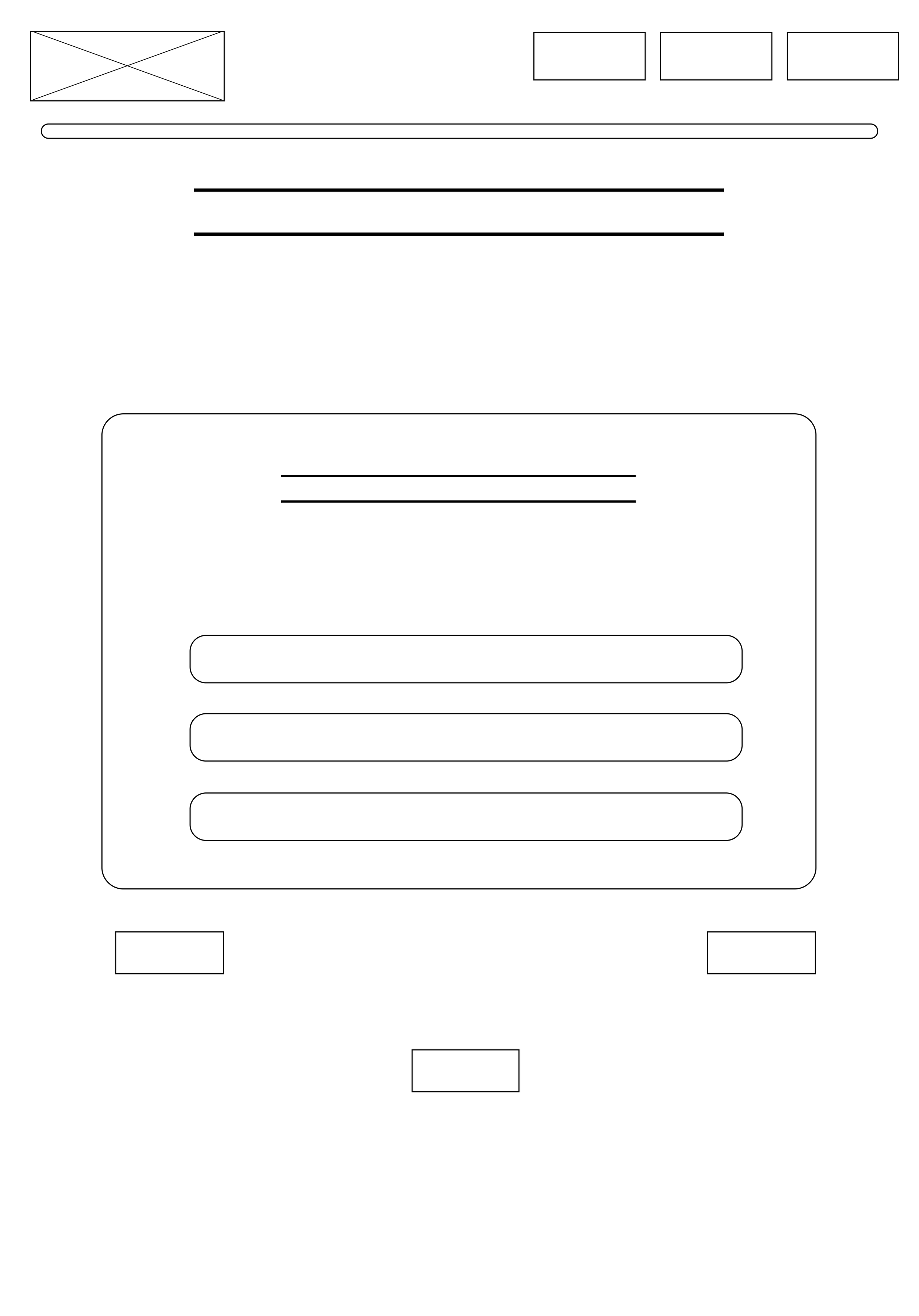
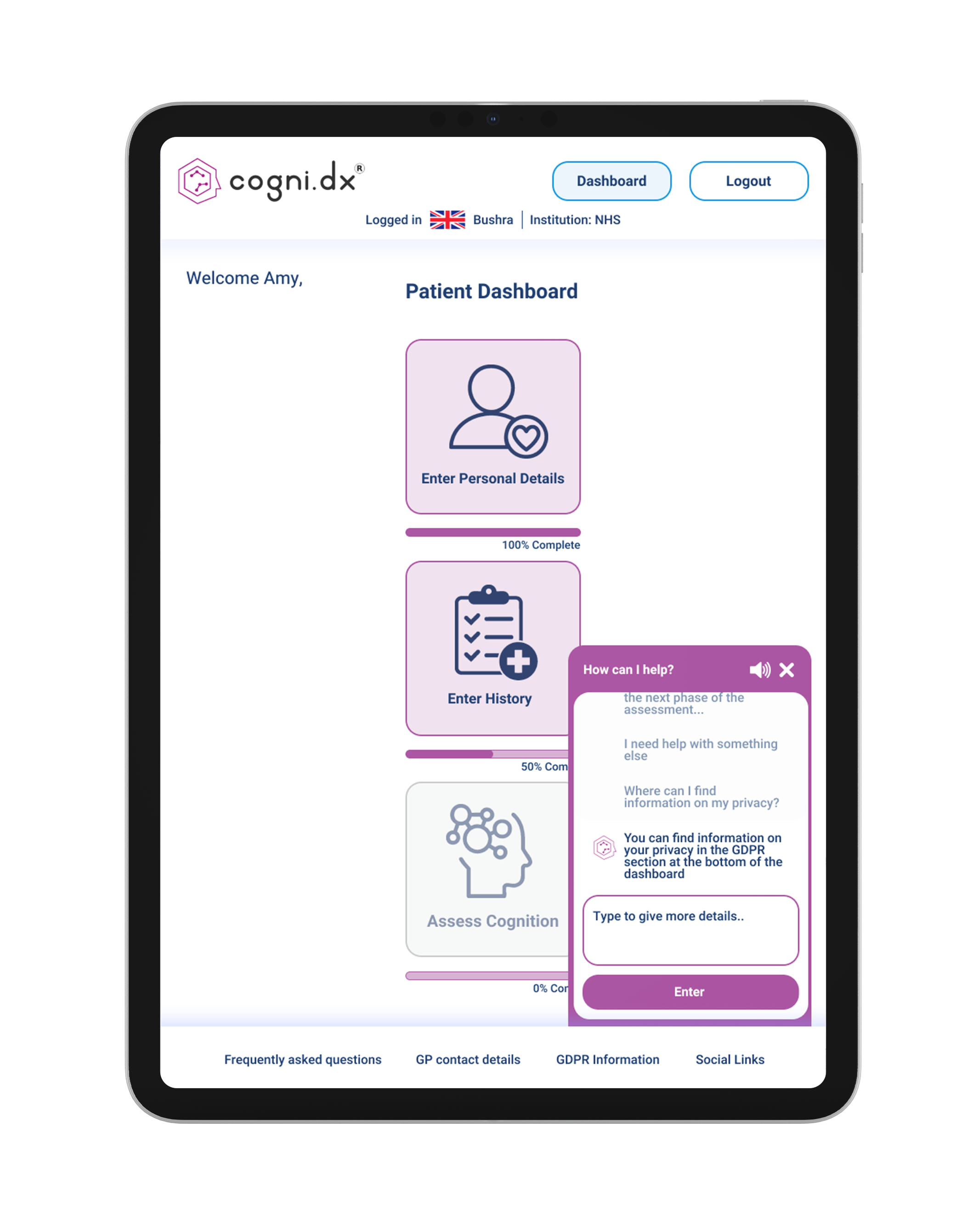
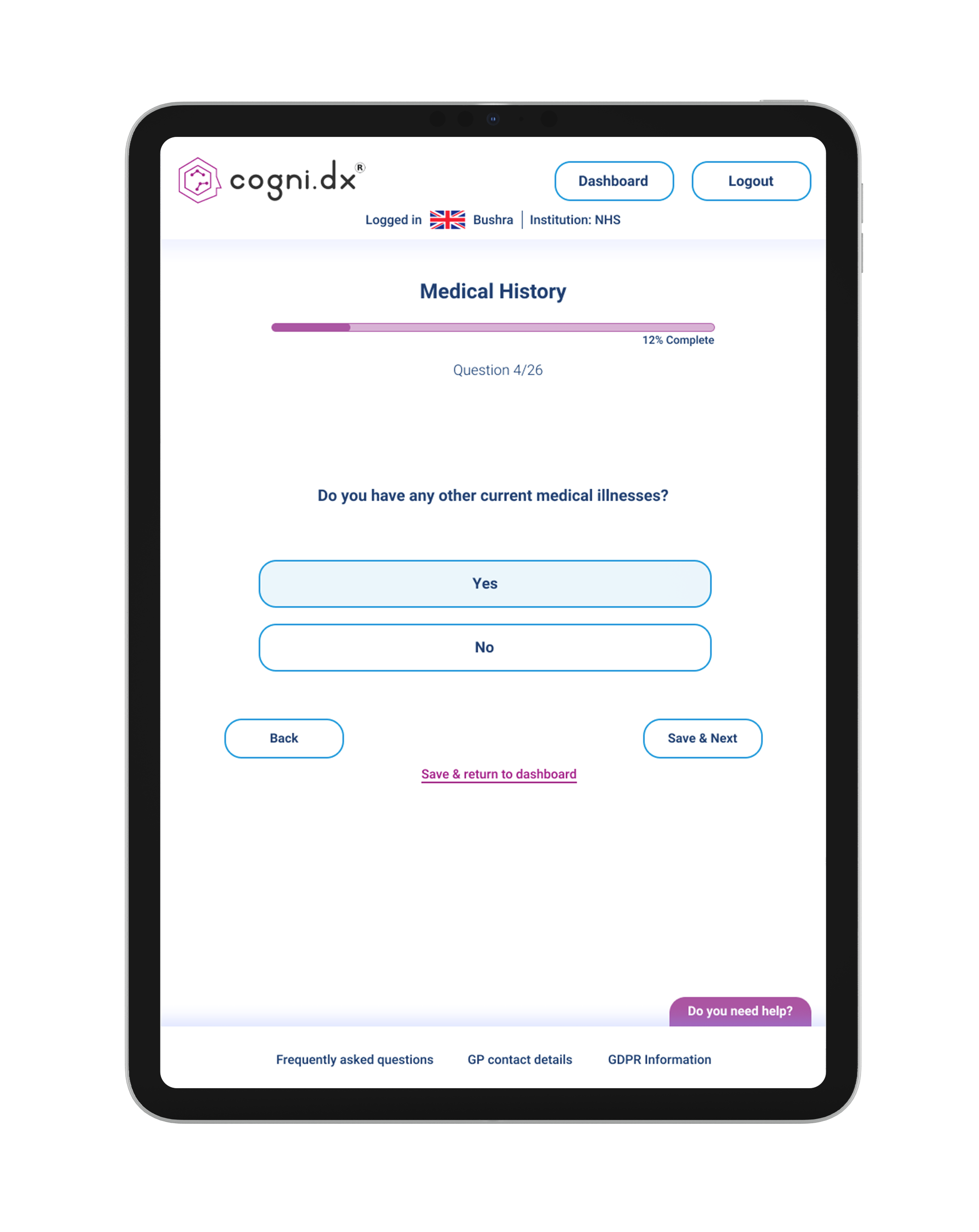
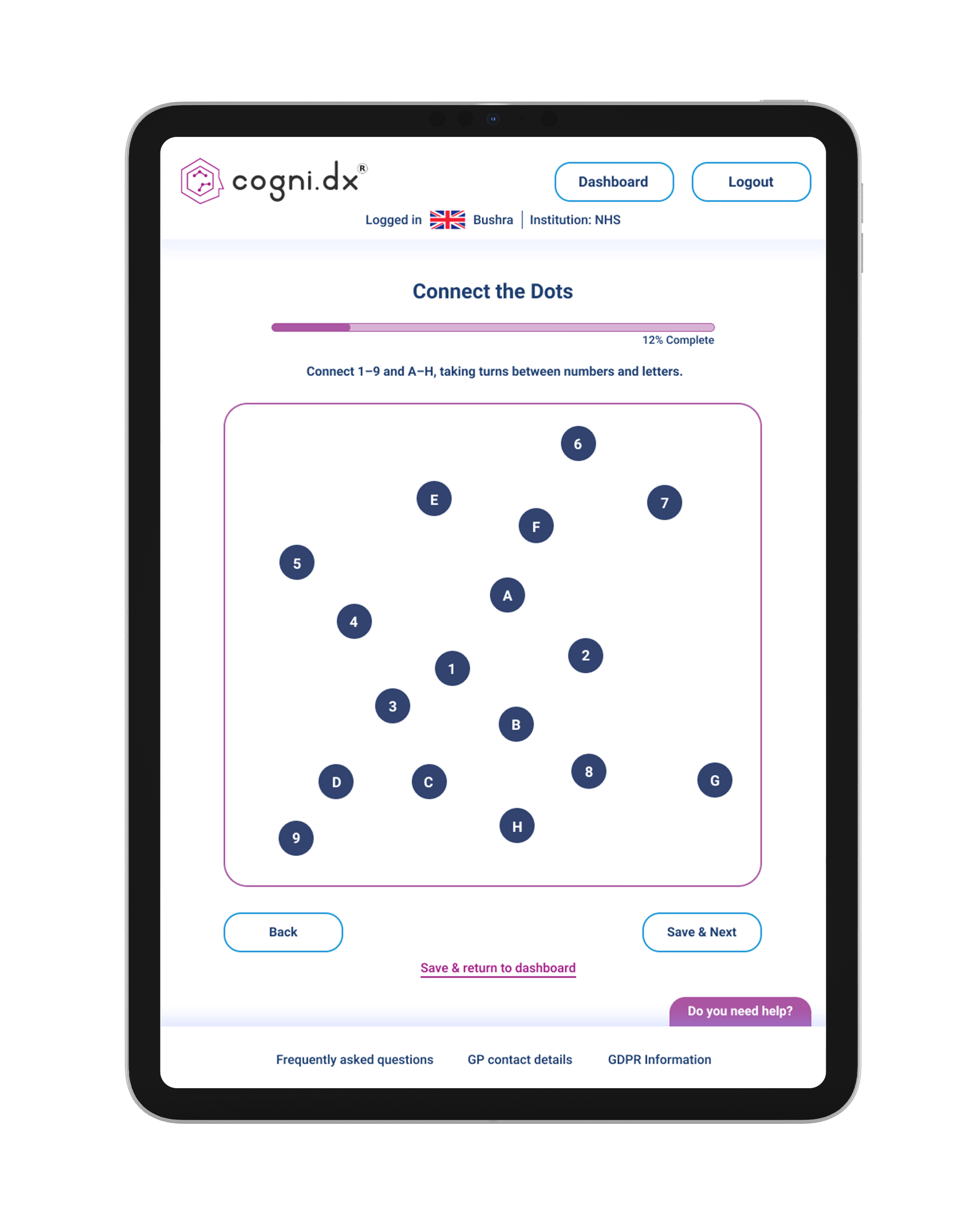
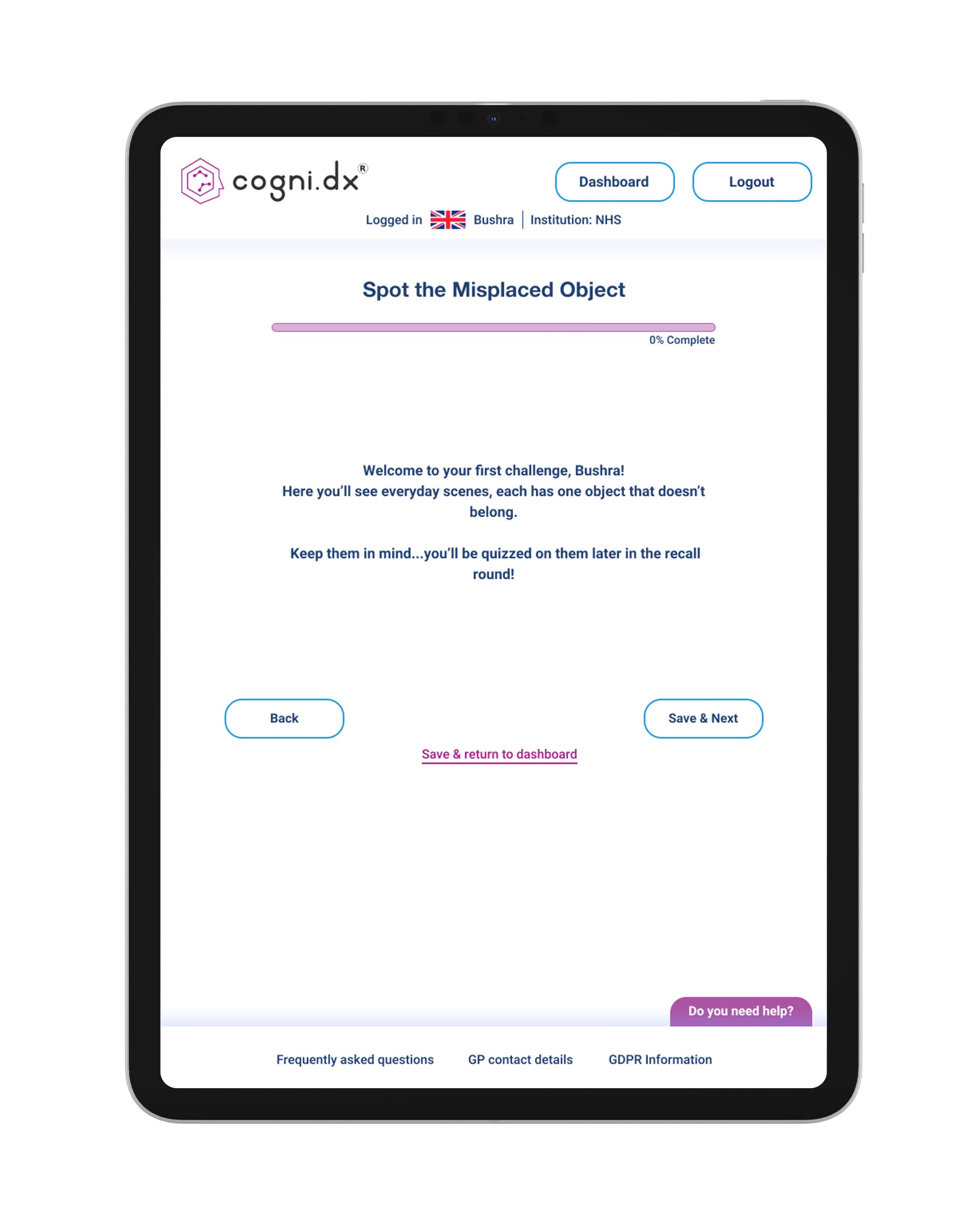
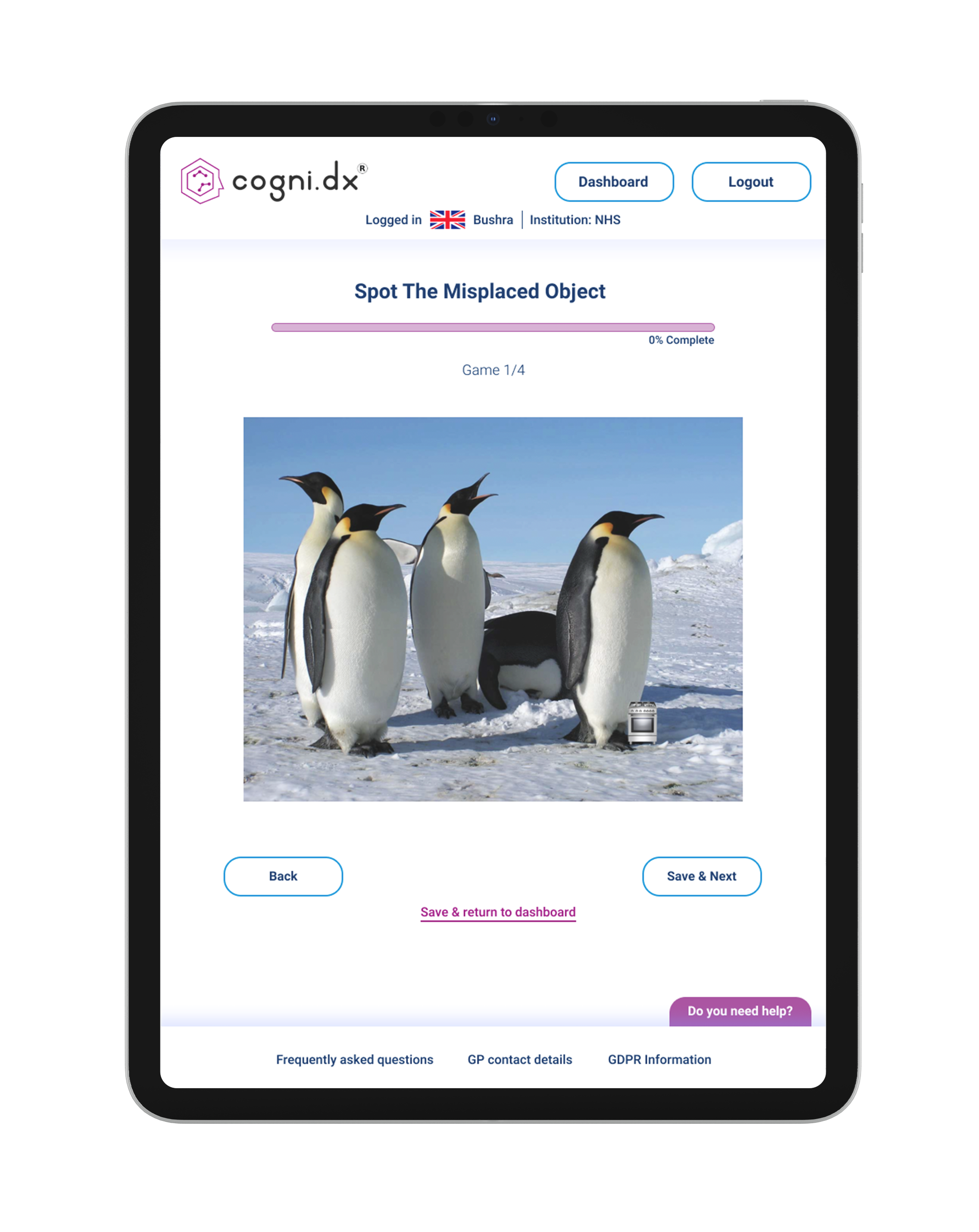
New updated design
Redesigned with an iPad first approach at the request of Cogni.Dx stakeholders, as the iPad is the product's primary device. The design prioritises vertical orientation based on research showing most users naturally hold iPads this way, while remaining responsive across vertical, horizontal, and desktop screens
The redesign delivers visible, actionable improvements across every interaction point:
All scrolling removed
Increased button sizes to 44x44pt minimum
Improved contrast ratios throughout (meeting WCAG AA/AAA standards)
Replaced formal language with plain supportive wording
Added clear completion states and progress indicators
Multimodal help system with audio and text options
Conclusion
I delivered a comprehensive set of research backed, high fidelity designs that directly address the critical usability barriers uncovered through user testing: scrolling confusion, poor contrast, small touch targets, unclear feedback, and overly complex language.
Biggest takeaway:
Research isn't optional when designing for cognitive impairment, it's the foundation. Assumptions about what "should" work don't hold when designing for vulnerable users navigating memory concerns. Every design decision, from removing scrolling to simplifying language, came directly from observing real users struggle with the existing interface.
Next steps:
Validate the designs through usability testing once development is complete, measuring task completion rates, time on task, and user confidence levels, then iterate based on clinical trial feedback to ensure the platform truly serves the users who need it most.